UI / UX DESIGN · 2025
Rafiji
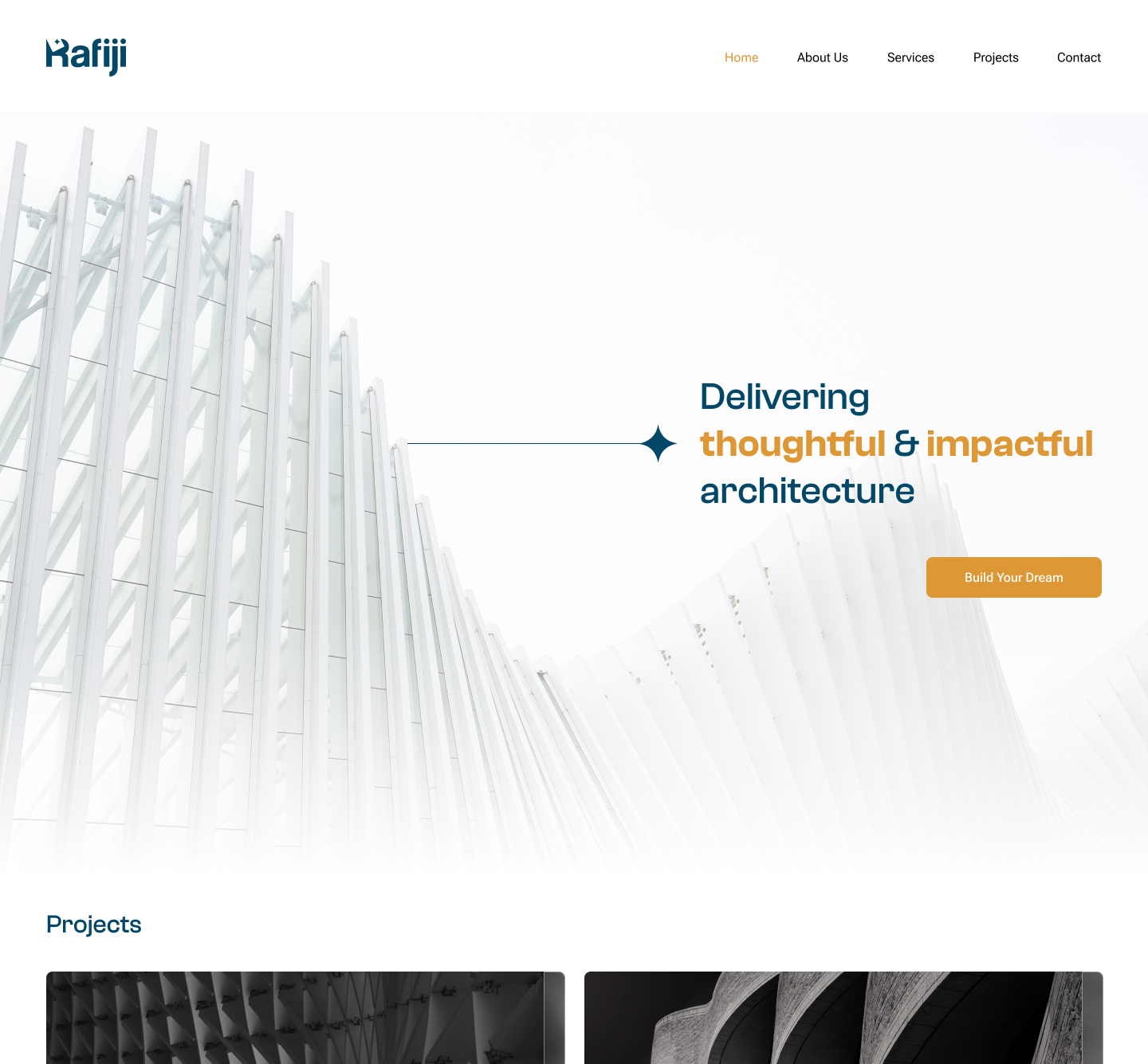
A modern, editorial-style website designed for Rafiji Trading, a construction and architecture-focused company based in Dubai, specializing in high-quality materials and architectural projects.
Final Product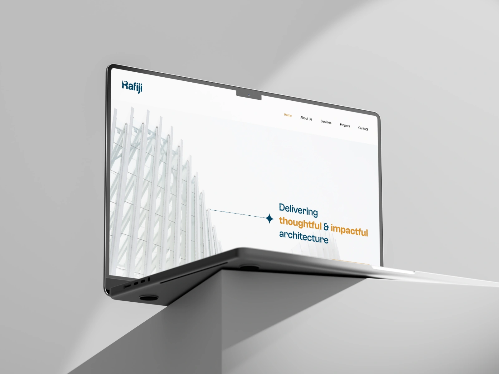
01 — OVERVIEW
What was the needs?
Rafiji Trading is a construction and architecture materials company based in Dubai, supplying high-quality materials for architectural projects across the region. They needed a website that did two jobs at once:
- Read as credible to architects and contractors making high-stakes sourcing decisions.
- Showcase materials in a way that felt tactile and premium rather than like a generic B2B catalog.
02 — THE PROBLEM
Challenges that we had to overcome
lack of a website made it hard for potential clients, architects, and contractors to quickly assess whether Rafiji carried the right materials for their project or not. There was no clear way to browse by material type, see real project applications, or gauge the company's credibility at a glance. So naturally We had to find a way to fix all that.
How might we design a site that lets technical buyers evaluate materials quickly, while still feeling as considered and high-end as the architecture Rafiji supplies?
03 — RESEARCH & DISCOVERY
What did we find out?
- Competitive audit: Reviewed 5 regional and international materials/trading sites to identify conventions worth keeping and gaps worth exploiting (most read as dated or overly corporate).
- Stakeholder interviews: Talked with Rafiji's team to understand what actually drives a sale.
- User needs: The primary audience (architects and contractors) needed to move from browsing to confidence fast: verifying material specs, seeing it used in a real project, and finding a direct way to request a quote.
Buyers trusted material photography and real project use far more than product descriptions, so the design needed to lead with imagery, not copy.
04 — INFORMATION ARCHITECTURE
Organizing the website for better experience
Reorganized the site around how a buyer actually evaluates a supplier, rather than around Rafiji's internal org chart:
This put projects and materials one click from the homepage, the two things a technical buyer needs before they'll pick up the phone.
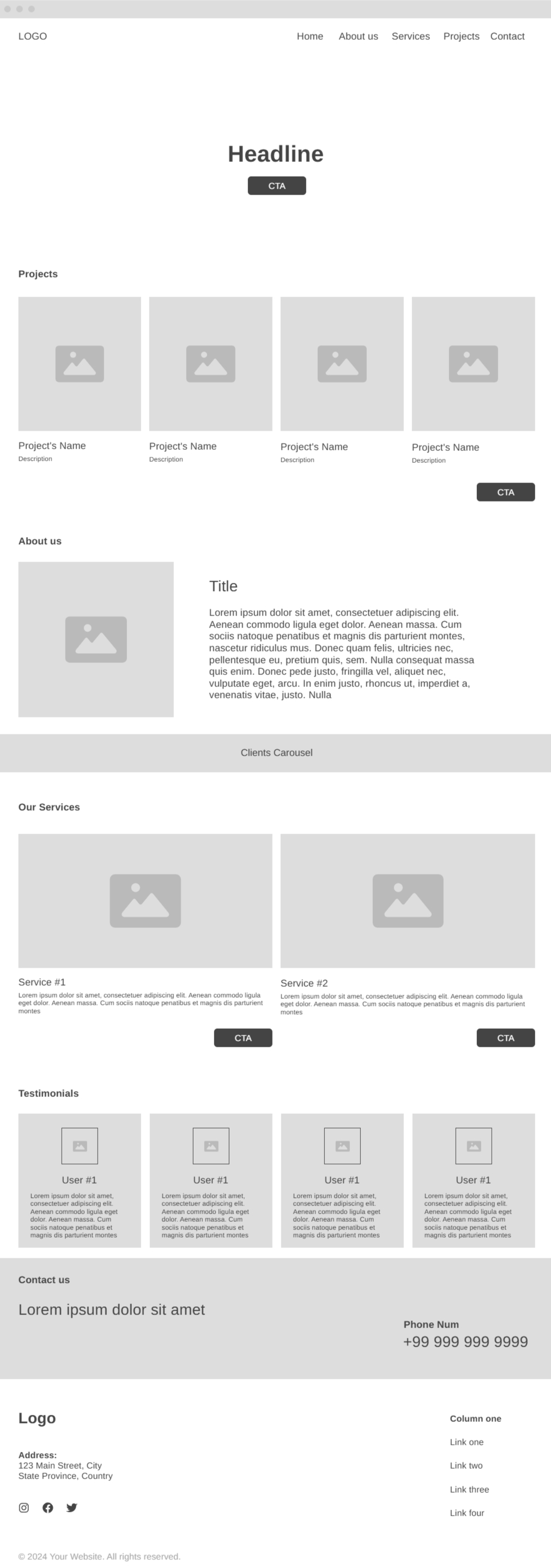
05 — WIREFRAMES
From structure to interface.
mapped the homepage-to-material-to-contact flow, testing how much editorial storytelling vs. straight product data the layout could carry before it started to feel slow.
Some sections of the wireframes were changed in the final product per client's request:
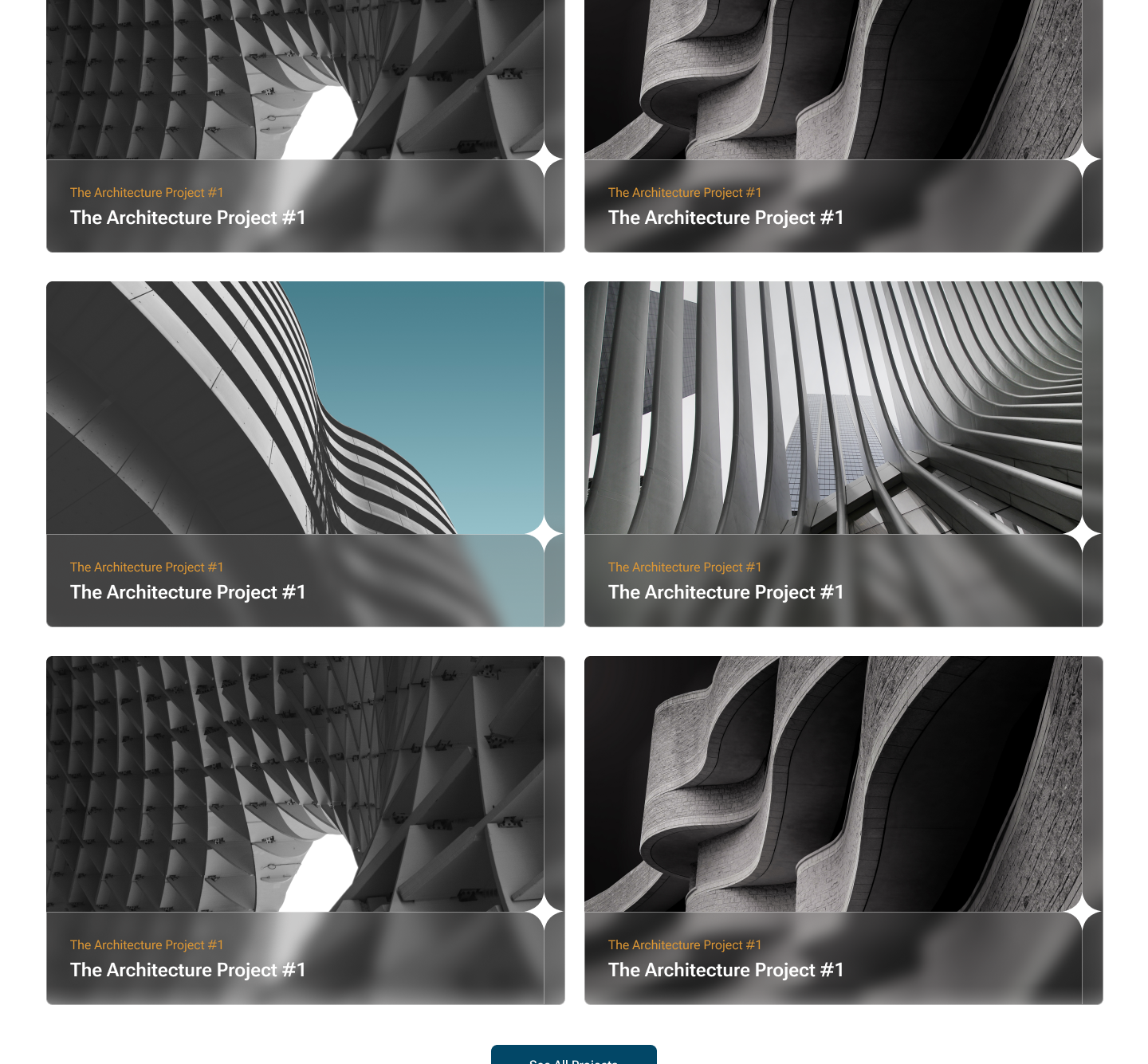
- Project section that contains 4 projects in a row were changed to 2 to highlight individuals project more and feel less crowded.
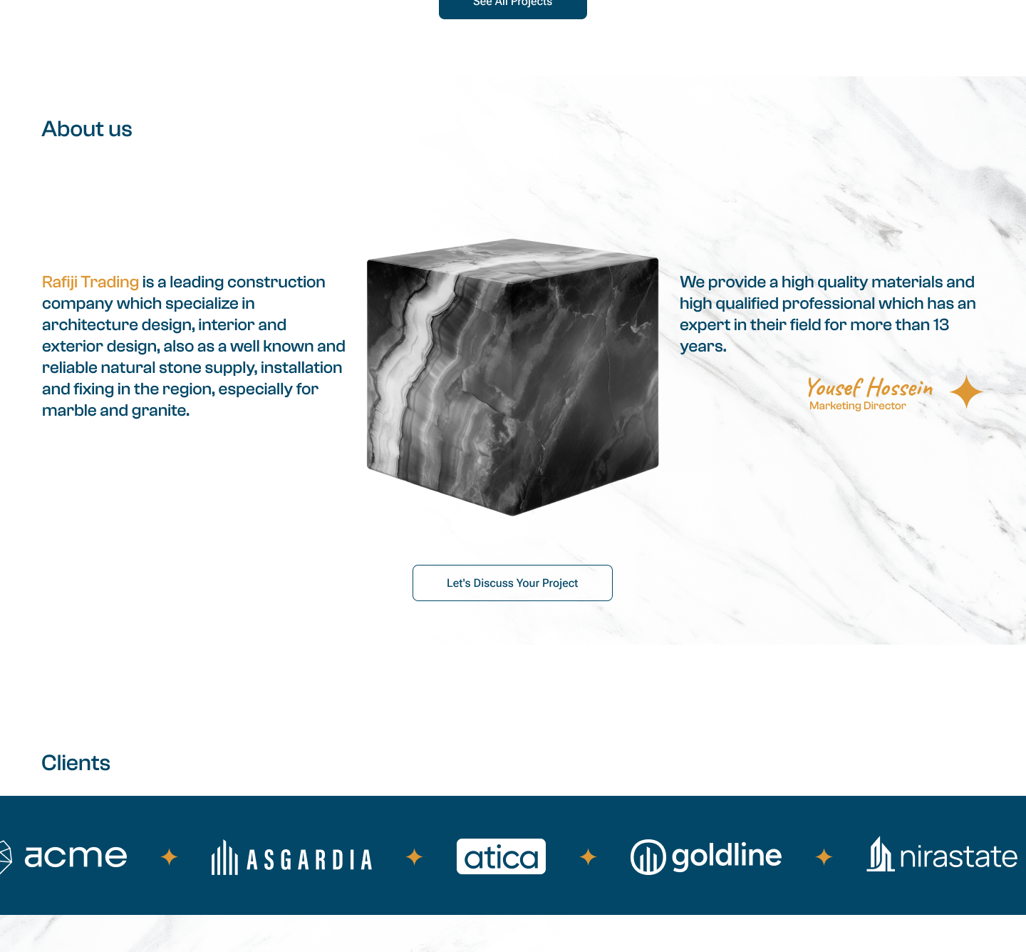
- Design of the about us section changed quite a lot as well, from a simple image on one side and text on another, I designed a more dynamic and modern layout as you can see it in the final product.
06 — DESIGN SYSTEM
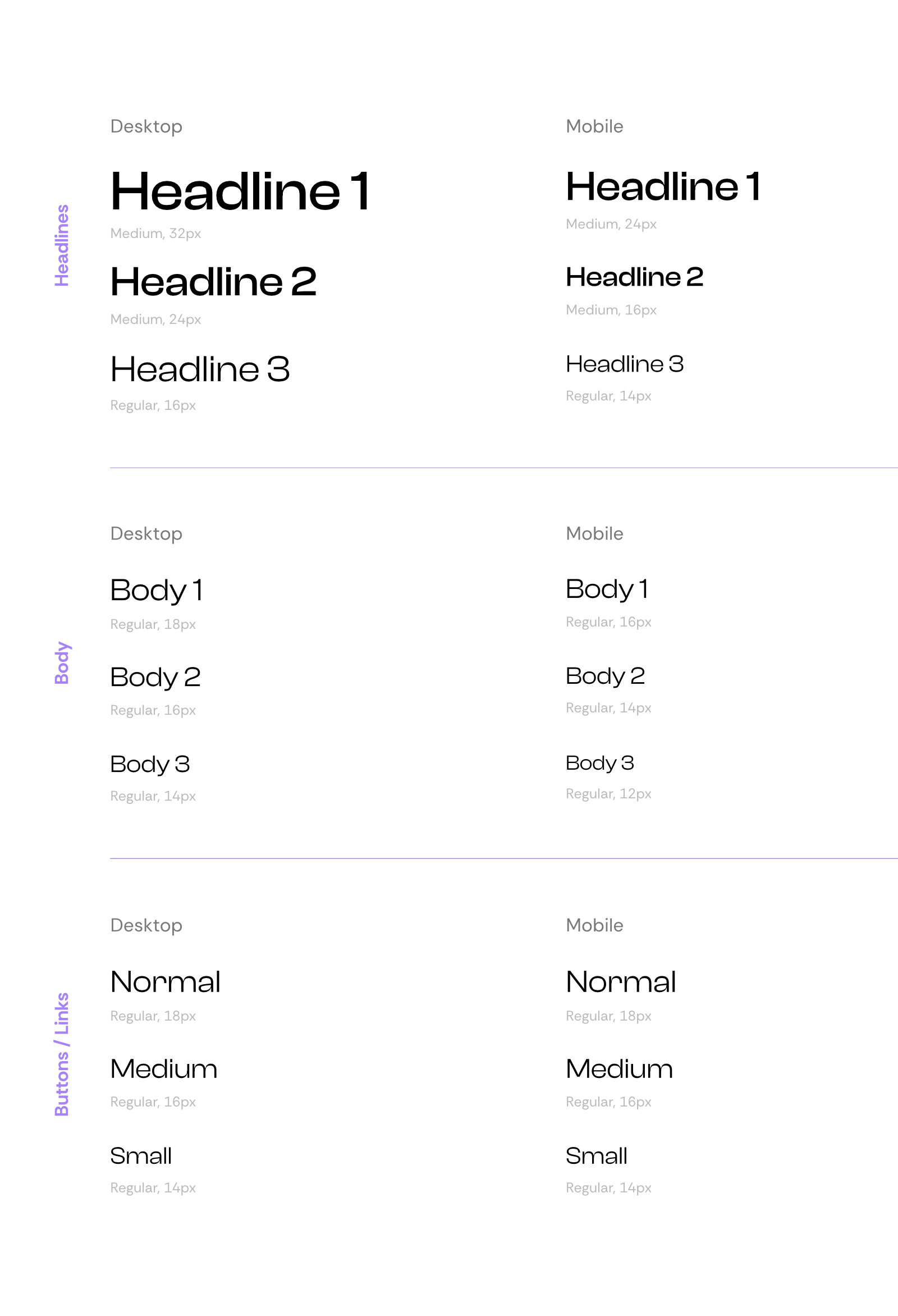
Typography
I used Clash Display font for this project because of bold and confident feeling it radiates as a title and at the same time it's readable as a body font. It also goes along well with the overall design language of Rafiji Project.
Color system
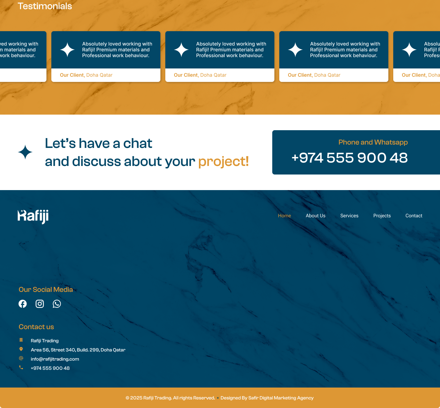
The color system for Rafiji was built around a premium architectural aesthetic, combining deep blue tones, warm gold accents, neutral backgrounds plus strong architectural imagery that elevates the whole thing.
The palette was intentionally kept restrained to maintain a luxury and professional feel.
Visual Language
A key part of the system is the use of architectural decorative elements, particularly the four pointed star deriving from Rafiji’s Logo appearing throughout the interface.
These elements act as a recurring brand motif, helping connect otherwise different sections of the page.
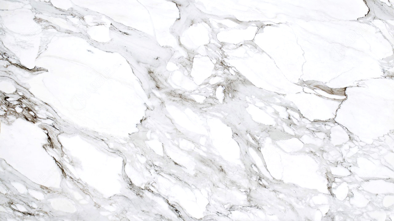 The system also uses:
Architectural photography + marble textures + geometric accents + restrained color palette to create a consistent visual identity.
Key Design Decisions
- Clear information hierarchy and intuitive navigation.
- Strong visual presentation of architectural projects.
- Consistent blue, white, and gold visual language.
- Editorial-style layouts inspired by modern architecture.
- Strategic use of imagery, textures, and whitespace.
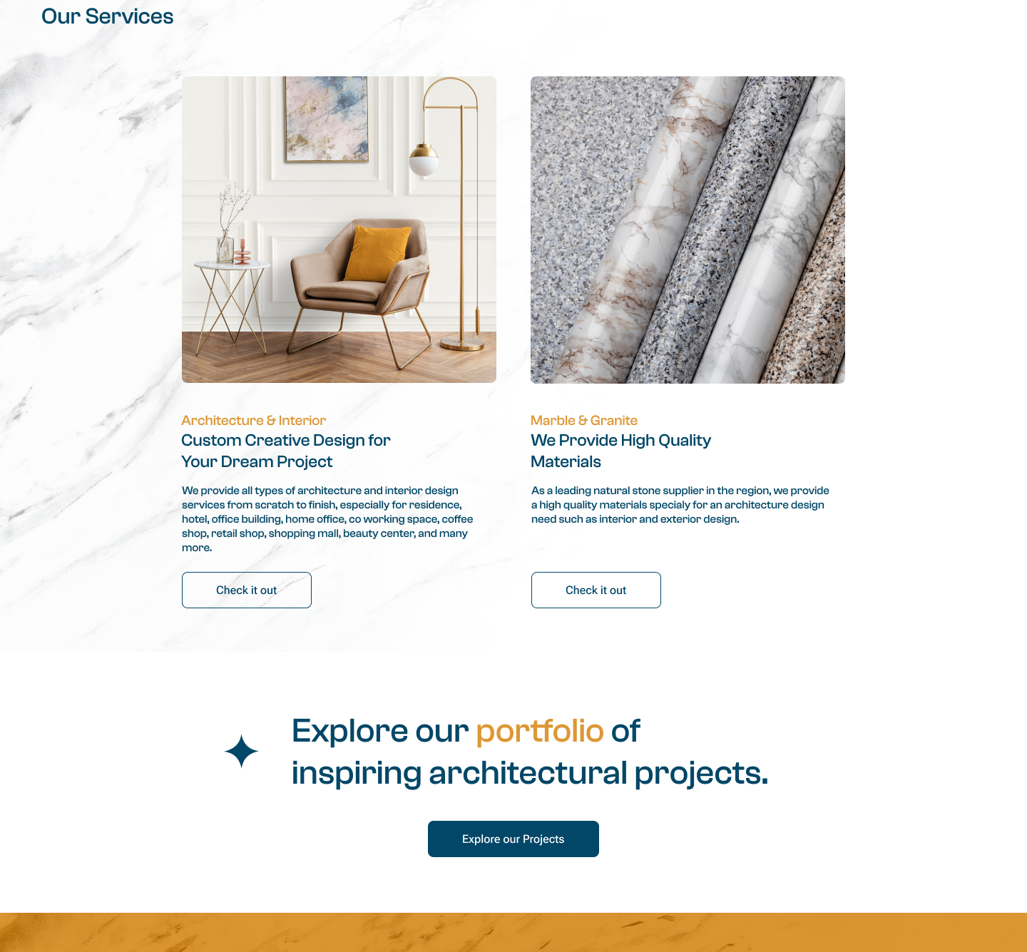
- Prominent CTAs to encourage project inquiries.
- Responsive web-oriented design approachvisual identity.
07 — FINAL DESIGN
The final experience.
The final interface combines the simplified information architecture with a consistent visual system and clear interaction patterns.
08 — REFLECTION
What I learned.
As it was one of my first real project as a ui/ux designer, I faced a lot of challenges and issues and the pace of the work was not great either. however through the project and collaborating with client and working with them I learned a lot and gained valuable experience.
This project reinforced the importance of establishing a clear structure before moving into visual design.
It also highlighted how a well-defined design system can make the interface more consistent while making future design decisions easier.